Jon Chaudhari
The website for the real estate agent included heaps of custom JavaScript, for the filtering of the properties with Angular, for the map page with the overlay calculation and the combination of the data with the map, for the extension of the plugin flexslider to enable the desired in-/off-focus look or the SVG mask animation of the buying process.
The JavaSript was also used to trigger all the nice CSS3 animation for the content loading effects.
Role
Front End Developer
Technologies
Javascript, Angular, SVGs, CSS3 (SASS), HTML5, Grunt
Year
2015
The Step animation for the buying process
The percentage based animation of the 5 steps was realized by animating a SVG mask with JavaScript. A scroll listener that moves the SVGs in the scrolled direction, creates an effect of the steps following you down the page.
Example of an animated masked circle 0 - 360 degrees:
5 stepsPROCESS
Example code of an animated mask from 72 to 144 degrees:
// initalizing the circleMask for the svg with id "mask2"
// it sets the mask of the svg, radius and start angle
var mask2 = new circleMask();
mask2.init(document.getElementById("mask2"), 121, 72);

// animate from 72 degrees to 144 degrees (when the svg appears on the screen)
...
mask2.draw(144);
...
The SVG with the mask that gets animated:
<svg version="1.1" xmlns="http://www.w3.org/2000/svg" xmlns:xlink="http://www.w3.org/1999/xlink" x="0px" y="0px" viewBox="0 0 242 242" enable-background="new 0 0 242 242" xml:space="preserve">
    <defs>
        <clipPath id="clip2">
            <path class="get-steps" id="mask2" data-from="72" data-to="144" d="">
            </path>
        </clipPath>
    </defs>
    <g class="sm-hide" style="clip-path: url(#clip2);">
        <linearGradient id="svg_2" gradientUnits="userSpaceOnUse" x1="121" y1="2" x2="121" y2="240" gradientTransform="matrix(1 0 0 -1 0 242)">
            <stop offset="0" style="stop-color:#206D9E"/>
            <stop offset="1" style="stop-color:#3E85B3"/>
        </linearGradient>
        <path fill="url(#svg_2)" d="M121,1C54.7,1,1,54.7,1,121s53.7,120,120,120s120-53.7,120-120S187.3,1,121,1z M121,221 c-55.2,0-100-44.8-100-100S65.8,21,121,21s100,44.8,100,100S176.2,221,121,221z"/>
    </g>
    <circle class="sm-hide" cx="121" cy="121" r="120" stroke="white" stroke-width="2" fill="transparent"/>
    <circle cx="121" cy="121" r="100" stroke-width="0" fill="black" fill-opacity="0.4"/>
</svg>
The code that does the calculations and animations:
// the function that animates the mask
var circleMask = function() {

    this.radius = 1;
    this.angle = 1;
    this.angleTo = 1;
    this.steps = 1;
    this.el = null;
    this.interval = false;
    this.point = {};

    this.init = function(el, radius, angle) {

        this.el = el;
        this.r = radius;
        this.angle = angle;

        this.point = this.polarToCartesian(this.radius, this.radius, this.radius, this.angle);

        var arch_flag = (angle <= 180) ? 0 : 1;

        var d = "M"+this.radius+", "+this.radius+" L"+this.radius+
                ",0 A"+this.radius+","+this.radius+" 0 " + arch_flag +
                ",1 " + this.point.x + "," + this.point.y + " z";

        this.el.setAttribute( 'd', d );
    };

    this.polarToCartesian = function (cX, cY, radius, angleInDegrees) {

        var angleInRadians = (angleInDegrees-90) * Math.PI / 180.0;

        return {
            x: cX + (radius * Math.cos(angleInRadians)),
            y: cY + (radius * Math.sin(angleInRadians))
        }
    };

    this.draw = function(angleTo) {

        if (this.interval) { clearInterval(this.interval); }

        this.angleTo = angleTo;

        this.steps = (this.angleTo - this.angle) / 100;

        var self = this;

        this.interval = setInterval(function() { self.animate() }, 5);
    };

    this.animate = function() {

        this.angle = this.angle + this.steps;

        // animate and clear interval when done
        ...
    }
};
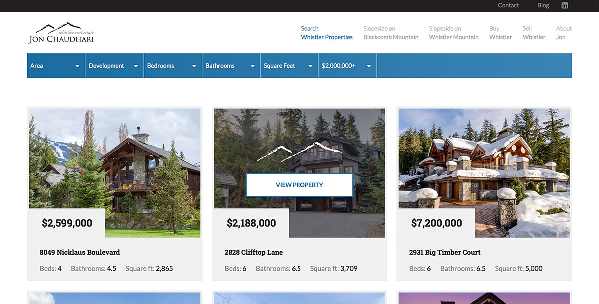
The Angular app for the listings
I used Angular to filter and paginate the listings data, and CSS3 animations to create a deferred loading effect for each listing.